Available tour step types
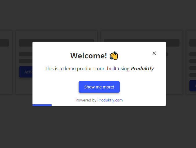
Welcome
Welcome tour step is a slightly larger than normal card, that you can use for example as the first step to engage the user to the tour. It also has a centered title.
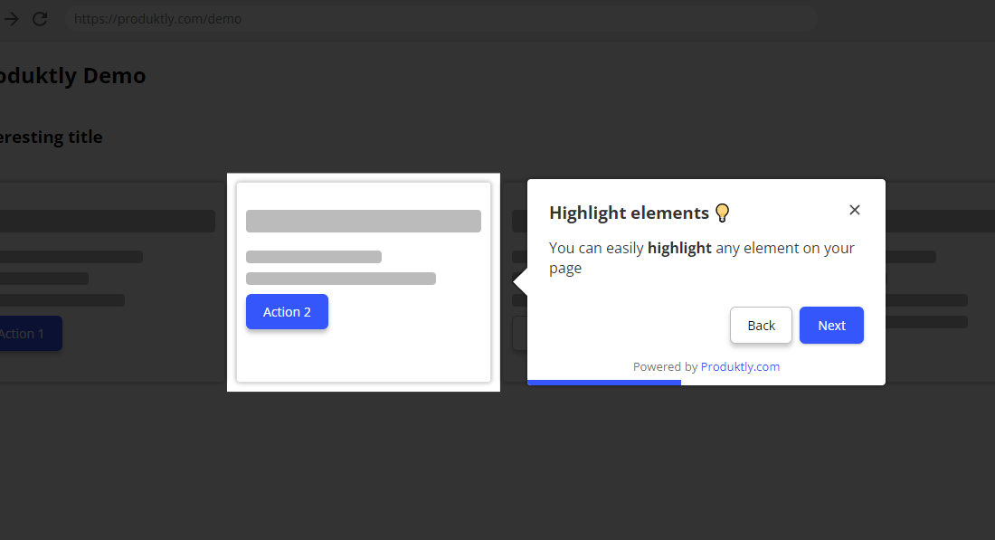
Highlight
With the highlight tour step, you can highlight elements in your page. The card positions next to the element you specify. You can configure:
- Direction - The position of the card relative to the element: Top, Left, Right, Bottom, or Auto. In Auto mode Produktly will automatically find the best position.
- Spotlight effect - Toggle the "spotlight" effect where the rest of the page is slightly darkened to draw attention to the highlighted element.
- Allow click events - When enabled, users can click on elements within the highlighted area. Useful when the highlighted element is interactive (e.g. a button they should click).
- Dismiss overlays on leave - When enabled, any modals or dropdowns that opened during this step will be dismissed when moving to the next step.
- Skip if not found - Controls what happens when the highlighted element can't be found within the timeout:
- No - The card is shown as a static modal in the center of the screen
- Yes - The step is skipped entirely and the tour moves to the next step
Card size
You can set a custom width and height (in pixels) for the highlight card. If the content exceeds the set height, the card becomes scrollable.
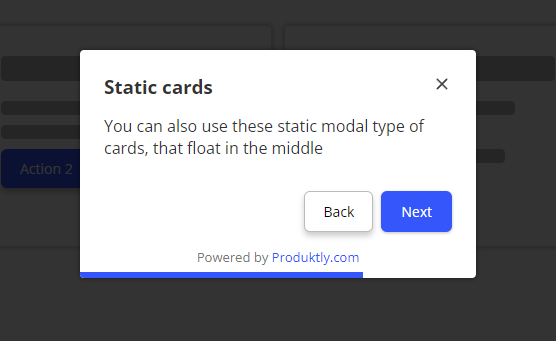
Modal
Modals position in the center of the screen. They're slightly smaller than the welcome card. Useful for giving general instructions without highlighting anything specific.
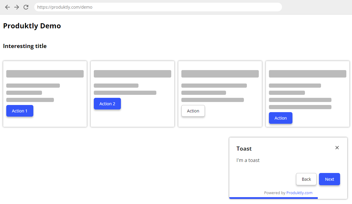
Toast
Toast positions itself in the bottom-right corner. It's useful for giving guidance without getting in the way.
- Show dark background - Toggle a dark overlay behind the toast for emphasis.
Redirect
You can configure redirect steps to automatically navigate the user to a different page. For example, if your tour starts on /welcome/ and needs to continue on /app/, add a redirect step that takes the user there automatically.
Redirect steps support dynamic URLs with user metadata.
Per-step button text
Each step can have its own custom button text for Next, Back, and Finish buttons, overriding the tour-level defaults.